Cutting Edge Web Design Focuses on Mobile Platforms
 If you are a business owner that has not made it to the mobile age then you are missing out on a large customer base. There are many people who no longer use a traditional computer and instead rely on their mobile devices for their searches, social marketing, online purchases and online banking transactions. Any business that is not taking advantage of this great marketing strategy needs to rethink their focus and get on board. If you have not yet optimized your website for mobile platforms then now is the time to rethink your web design and shift your focus to mobile platforms.
Manipulation on a Small Screen
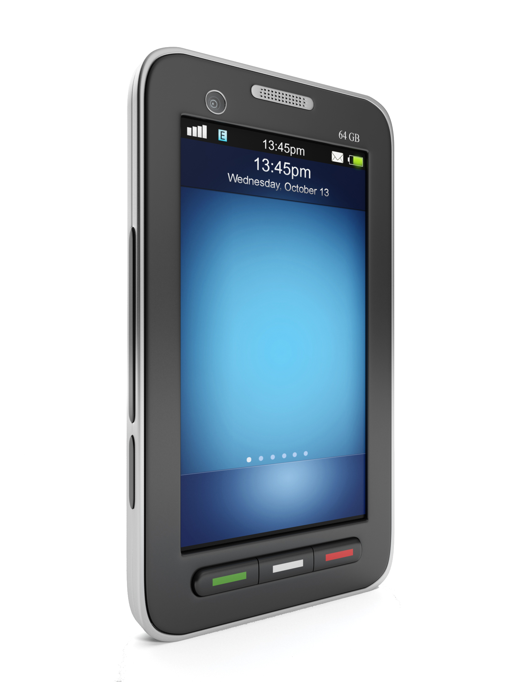
Your website needs to be optimized to be viewed on smaller screens so that those with mobile devices can see the content easier. The entire point of mobile devices is portability and if your website is made for home computers then these mobile devices will have a difficult time displaying them. Your potential customers will have to do a lot of work just to look at one page and this can be frustrating. It is more difficult for your viewers to hit the links to your products or the shopping cart and they may just leave the site because other sites are easier to navigate.
Customers are Buying from Optimized Websites
Sadly for those who are not mobile optimized, customers are buying from those websites that are ready for the more mobile world. If you want to have any chance at competing in the online world today, you have to have web design that is ready for mobile phones and tablets. Many web designers are now learning how to create great web pages for these types of displays and if your web designer can’t help you then you need to find a new one who is up on the latest technologies. If you are doing your own web design then it may be time to call in a professional who can help you get your website up to the mobile viewing standards.
Retina Displays are Taking Over
One of the latest trends in mobile devices is retina displays and iPads and other devices are now coming out with their versions of this. These displays double the pixels of normal displays and for this reason there is a huge need for denser website layouts from web designers. This is the only way that websites can look good when being displayed on these types of screens. Luckily web designers are now learning to optimize websites for retina displays to take advantage of the new pixilation issues. So it is important for designers to concentrate on growing websites that are more streamlined and seamless to keep up with this new technology.
If you want to be competitive in today’s online market then you have to be optimized for mobile devices. Web design is changing and growing and you have to keep on top of these changes because you can bet your competitors are certainly taking advantage of them!