Mobile Web Design Tips and Tricks
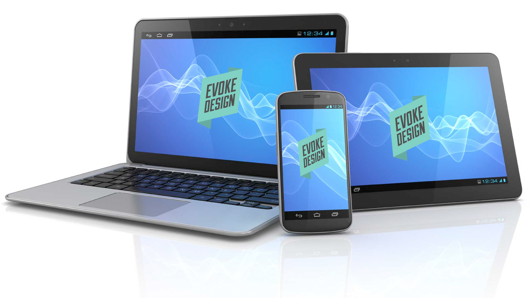 It is very important in this mobile based world that we live in to have a website that is optimized for mobile devices such as smart phones and tablets. What this entails is having a website that is sized for the smaller screen of these devices while still looking great and having outstanding navigation ability. It also needs to have the ability to be touch screen optimized with well thought out links and geolocation functions. This used to be very difficult for web designers to do but today, it is becoming much easier to optimize web design for mobile device. Below are just a few tips and tricks to help you on your way.
Resources for Mobile Coding
If you don’t have any knowledge of HTML or CSS or you simply don’t have the time to do all this coding on your own, you can find plenty of resources online that can help you with your efforts. MoFuse Basic and Premium are great ways to create mobile versions of websites and have been around for a few years now. You can also try Mippin which is a free platform that allows you to convert computer based websites into mobile platforms. Finally, mobiSiteGalore helps designers to put together mobile versions of any website and offers a fully customizable platform. Any of the above can help the savvy web designer to create great mobile based websites.
Addons for Publishing Systems
While it is great to have a mobile based website, it is also important to have features that are directly related to the operating systems they will be viewed on such as Android or iPhone. It is possible to customize features for all of the top systems by using different style sheets for them. When you are using a publishing system such as WordPress, you have the option of a few plugins that you can use to customize your mobile websites. Some of the top plugins are WPtouch, WordPress Mobile Edition, WordPress Mobile Pack, WPtap, WordPress Mobile by Mobify, Mobile Plugin for Drupal and OSMOBI. Any of these can help you to get the most out of your custom based mobile websites.
Other Tools for Mobile Websites
There are other tools that you can use to create mobile websites and all you have to do is search a little and you can find them all over the internet. Of course, they all have different features so you may need to play with them a little to find the ones that help you the most to get the best mobile websites possible. With all the resources available today, it is insane to think that web designers are not using these applications and tools to create stunning and properly formatted mobile websites.
If you want to have a great website then you need to include a mobile platform that is designed for the specific operating systems such as Android, iPhone, Windows Mobile and Blackberry, the top four on the market today. If you are not optimizing your mobile websites then you will lose out to the competition very quickly.