Web Design: Four Things to Avoid
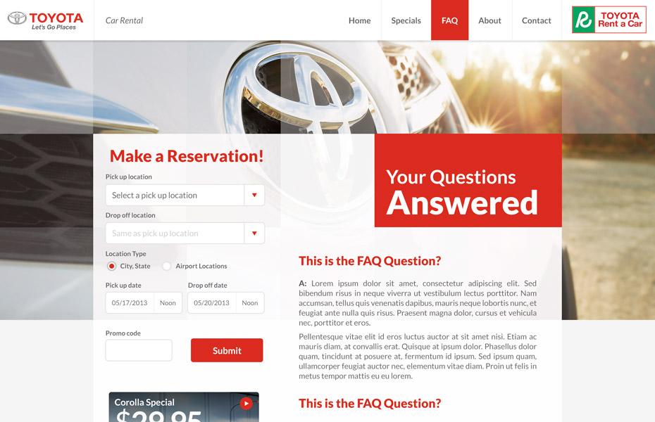 Your web design says a lot about your company so it’s important to make a good impression and you may only have a few seconds to do it. Visitors form an opinion of your company within the first seconds of viewing your landing page. This is your opportunity to capture their attention and make them interested in your products or services. However, a poor web design will have the opposite effect and send visitors to the competitors.
Here are four things to avoid in your web design that will help you make a good impression and get better responses from your viewers.
Poor Performance
Poor performance includes pages that load too slowly and difficulty navigating through the site. If a website is taking too long, many users will click the back button and try a different site instead of waiting for it to load. There are too many other options available for you to make your visitors wait and it will have a negative effect on your business.
One way to ensure faster landing pages is to keep it simple. Avoid large graphic images, banners and pop-ups that can really slow down performance. You also want to make it easy for your visitors to find what they’re looking for when navigating through your site.
Inconsistent Design and Formatting
This big mistake will make your web design look messy and unprofessional. It creates confusion and gives the impression that your company is unorganized. As a result, it discourages sales because consumers don’t want to make purchases from companies that appear unorganized and unreliable. You can avoid this mistake by making sure all of your pages follow the same format. You should also choose a font that is easy to read for a more professional look and you’ll get better results.
Crowded Text
Crowding too much text on your landing page can be a little overwhelming. Users don’t want to sift through a page full of text to find what they’re looking for, so avoid big blocks of text that’s crowded together and hard to read. Spread your text out by taking advantage of white space and use headers to break it up and that will make it easy for your visitors to read and find the information they seek.
Not Making Your Intent Clear
When users visit your site, they should immediately know what you have to offer. Don’t make them search around to find out what your company is all about. The landing page should clearly outline the products and services you have to offer or you risk sending your visitors to one of your competitors.
The Internet is fast-paced and you have to cater to this type of environment in order to get the attention of users. They won’t waste time with sites that perform poorly or that is hard to read and navigate. They need to know right from the start that you have what they’re searching for or they will leave your site and look for the information they need somewhere else.